Introduction to spectral graph wavelets
This tutorial will show you how to easily construct a wavelet frame, a kind of filter bank, and apply it to a signal. This tutorial will walk you into computing the wavelet coefficients of a graph, visualizing filters in the vertex domain, and using the wavelets to estimate the curvature of a 3D shape.
As usual, we first have to import some packages.
>>> import numpy as np
>>> import matplotlib.pyplot as plt
>>> from pygsp import graphs, filters, plotting, utils
Then we can load a graph. The graph we’ll use is a nearest-neighbor graph of a point cloud of the Stanford bunny. It will allow us to get interesting visual results using wavelets.
>>> G = graphs.Bunny()
Note
At this stage we could compute the Fourier basis using
pygsp.graphs.Graph.compute_fourier_basis(), but this would take some
time, and can be avoided with a Chebychev polynomials approximation to
graph filtering. See the documentation of the
pygsp.filters.Filter.filter() filtering function and
[HVG11] for details on how it is down.
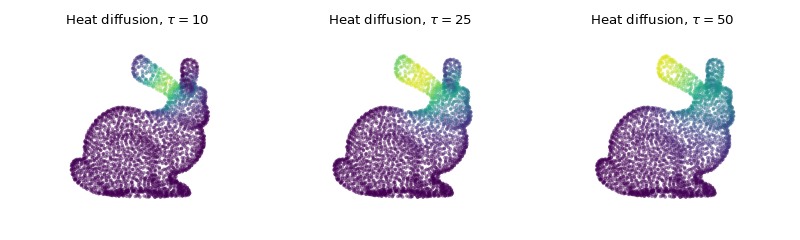
Simple filtering: heat diffusion
Before tackling wavelets, let’s observe the effect of a single filter on a graph signal. We first design a few heat kernel filters, each with a different scale.
>>> taus = [10, 25, 50]
>>> g = filters.Heat(G, taus)
Let’s create a signal as a Kronecker delta located on one vertex, e.g. the vertex 20. That signal is our heat source.
>>> s = np.zeros(G.N)
>>> DELTA = 20
>>> s[DELTA] = 1
We can now simulate heat diffusion by filtering our signal s with each of our heat kernels.
>>> s = g.filter(s, method='chebyshev')
And finally plot the filtered signal showing heat diffusion at different scales.
>>> fig = plt.figure(figsize=(10, 3))
>>> for i in range(g.Nf):
...     ax = fig.add_subplot(1, g.Nf, i+1, projection='3d')
...     title = r'Heat diffusion, $\tau={}$'.format(taus[i])
...     _ = G.plot(s[:, i], colorbar=False, title=title, ax=ax)
...     ax.set_axis_off()
>>> fig.tight_layout()
Note
The pygsp.filters.Filter.localize() method can be used to visualize a
filter in the vertex domain instead of doing it manually.
Visualizing wavelets atoms
Let’s now replace the Heat filter by a filter bank of wavelets. We can create a
filter bank using one of the predefined filters, such as
pygsp.filters.MexicanHat to design a set of Mexican hat wavelets.
>>> g = filters.MexicanHat(G, Nf=6) # Nf = 6 filters in the filter bank.
Then plot the frequency response of those filters.
>>> fig, ax = plt.subplots(figsize=(10, 5))
>>> _ = g.plot(title='Filter bank of mexican hat wavelets', ax=ax)
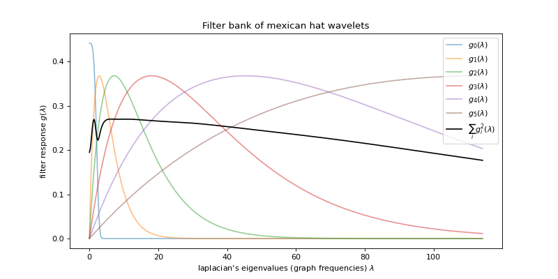
Note
We can see that the wavelet atoms are stacked on the low frequency part of
the spectrum. A better coverage could be obtained by adapting the filter
bank with pygsp.filters.WarpedTranslates or by using another
filter bank like pygsp.filters.Itersine.
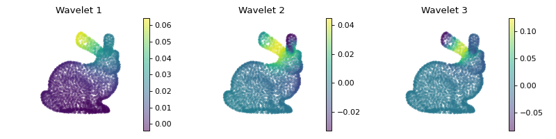
We can visualize the atoms as we did with the heat kernel, by filtering a Kronecker delta placed at one specific vertex.
>>> s = g.localize(DELTA)
>>>
>>> fig = plt.figure(figsize=(10, 2.5))
>>> for i in range(3):
...     ax = fig.add_subplot(1, 3, i+1, projection='3d')
...     _ = G.plot(s[:, i], title='Wavelet {}'.format(i+1), ax=ax)
...     ax.set_axis_off()
>>> fig.tight_layout()
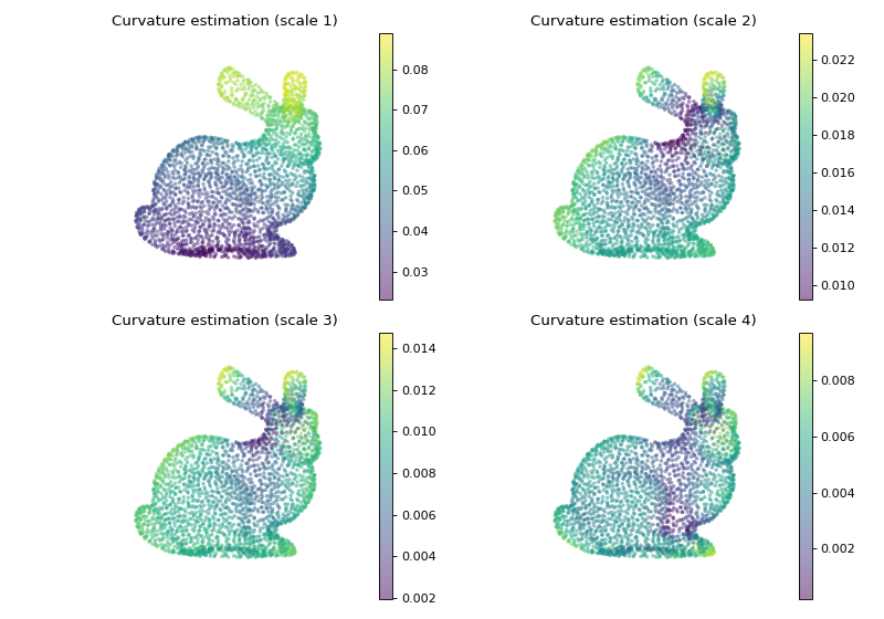
Curvature estimation
As a last and more applied example, let us try to estimate the curvature of the underlying 3D model by only using spectral filtering on the nearest-neighbor graph formed by its point cloud.
A simple way to accomplish that is to use the coordinates map \([x, y, z]\) and filter it using the above defined wavelets. Doing so gives us a 3-dimensional signal \([g_i(L)x, g_i(L)y, g_i(L)z], \ i \in [0, \ldots, N_f]\) which describes variation along the 3 coordinates.
>>> s = G.coords
>>> s = g.filter(s)
The curvature is then estimated by taking the \(\ell_1\) or \(\ell_2\) norm across the 3D position.
>>> s = np.linalg.norm(s, ord=2, axis=1)
Let’s finally plot the result to observe that we indeed have a measure of the curvature at different scales.
>>> fig = plt.figure(figsize=(10, 7))
>>> for i in range(4):
...     ax = fig.add_subplot(2, 2, i+1, projection='3d')
...     title = 'Curvature estimation (scale {})'.format(i+1)
...     _ = G.plot(s[:, i], title=title, ax=ax)
...     ax.set_axis_off()
>>> fig.tight_layout()